
Conferences, Training and Webcasts
Resources for getting started and learning about AI.

Use Cases
Explore various data science EPRI use cases to further here.
External Resources
Additional data science resources.
This the multi-page printable view of this section. Click here to print.
Resources for getting started and learning about AI.
Explore various data science EPRI use cases to further here.
Additional data science resources.
Predictive Analytics World The “premier machine learning conference.” Tracks in industry, deep learning, business, and more. Includes speakers, workshops, and networking opportunities.
Machine Learning and Data Mining (MLDM) Brings together researchers on machine learning and data mining. Conference includes talks, workshops, tutorials and exhibition.
AI & Big Data Expo Expo showcases next gen technologies and strategies from AI and big data. Tracks include Enterprise AI & Digital Transformation, Data Analytics for AI & IoT, Big Data Strategies and more.
Michael O' Connor
Explorable Explanations project (Bret Victor’s brainchild) description. http://worrydream.com/ExplorableExplanations/.
There are several really good videos on YouTube and other media sites of Bret Victor giving presentations on this topic.
One of my favorites is his presentation on Media for Thinking the Unthinkable (https://vimeo.com/67076984).
Algorithms relating to sorting, sampling, and graphs (AMAZING)
Fully Interactive and Dynamic Linear Algebra textbook
Have you ever wanted to see an algorithm’s code run? It’s cooler than you would expect.
Added Bonus: Not only does it have an impressive collection of pre-built algorithms to choose from, but it also allows you to input your own code!
Nearly all of Digital Signal Processing using Fourier Transforms explained visually
Probability and Statistics (2017 Kantar Information is Beautiful Winner)
The full data science workflow that is embedded in StitchFix’s business process (really cool)
Coursera, Udacity, and codeacademy are good start points.
Datacamp is an example of an interactive web environment with lots of lessons for non-programmers to get started without ever speaking one of the languages.
Data Science Central is a good resource for staying at forefront of industry trends in data science.
Kaggle hosts data science competitions to practice, hone in skills with messy, real world data, and tackle actual business problems. Employers take Kaggle rankings seriously, participation is seen as relevant, hands-on project work.
KDnuggets has compiled an extensive list.
[http://www.kdnuggets.com/2015/07/good-data-science-machine-learning-cheat-sheets.html]
Data Science CheatSheets are there to help.
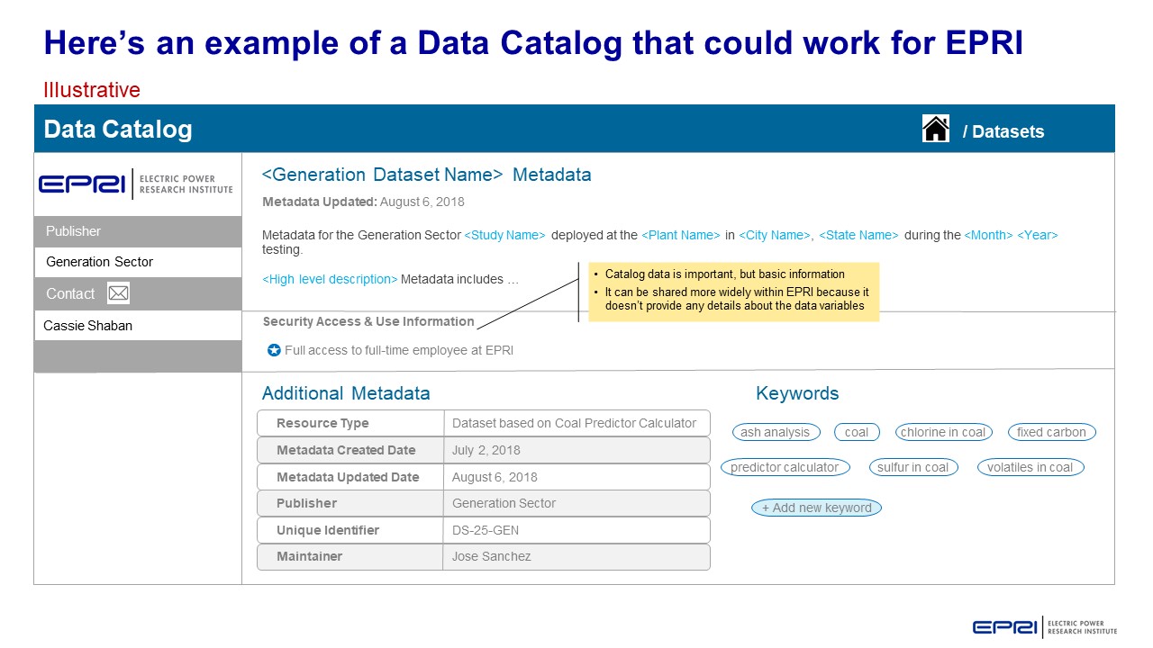
Metadata schema examples that help others at EPRI know what kind of data is available for them to use in research and how to search for this data.
This is a high level overview of the journey that PDU and its members are likely to follow for Data Analytics.
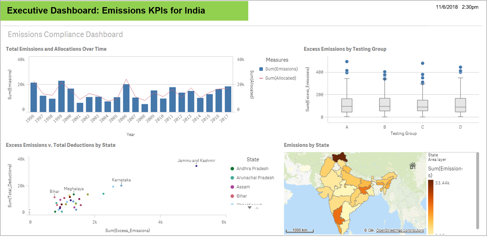
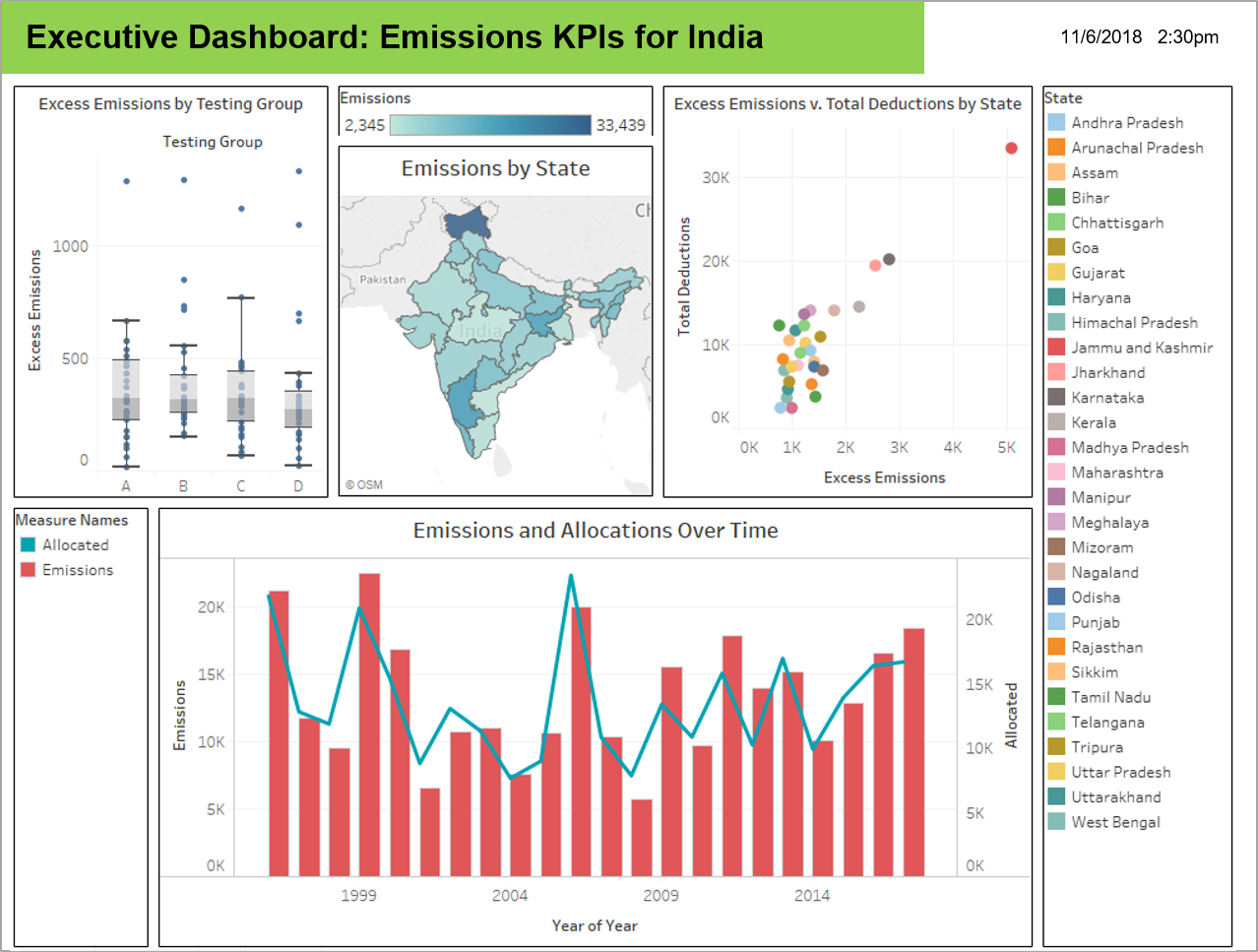
Data visualizations that highlight new insights. This use case took dat from a predictor tool in Generation to discover new insights with visualizations.
This use case shared preliminary data science findings with members to demonstrate a different view of their metrics.
Find more information on how to Leverage Data Science Smartly here.
Find more information here.
Visualizations help to identify patterns in data to discover and understand stories.
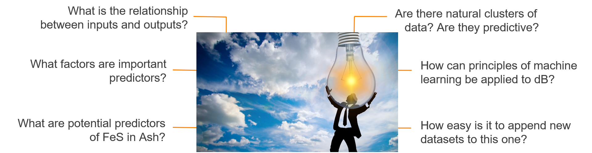
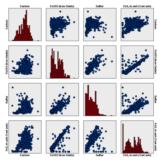
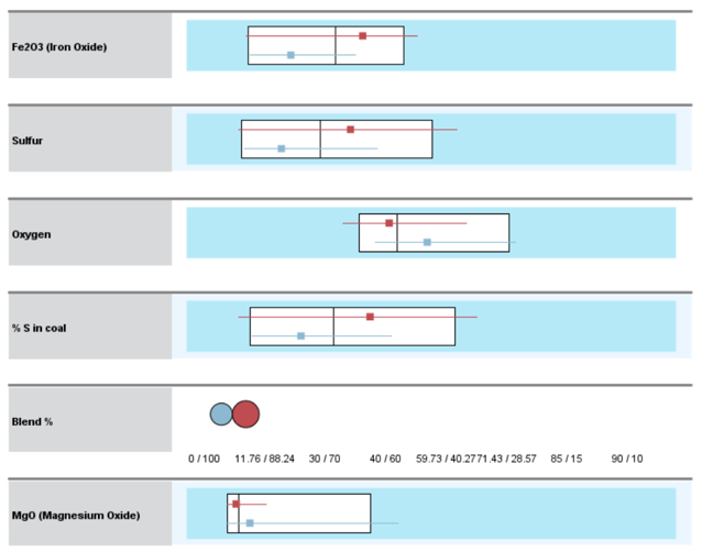
Target = FeS in Ash (% weight)
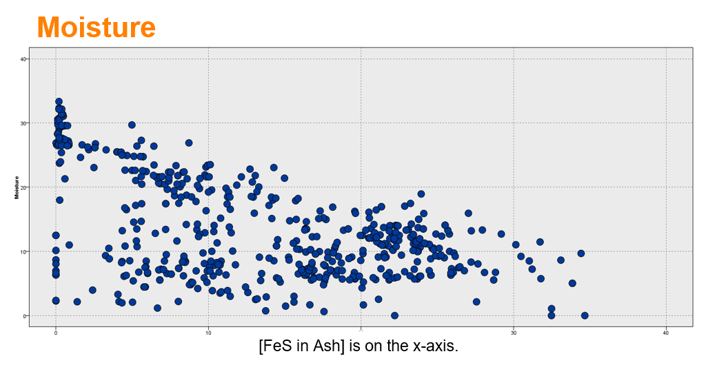
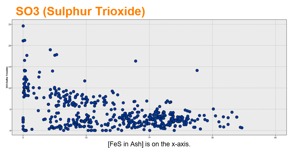
These charts show a mixed relationship with FeS in Ash (% weight). There may be two (or more) patterns.
Box plots show the median surrounded by the interquartile range (25th percentile to 75th percentile. The 2 clusters are well-separated.)
Learn more here.
Opportunity to use data science share with members a different point of view of their data.
Multivariate analysis: Provide members with more sophisticated understanding of the benchmark data by applying multivariate analysis. Discover the interrelationships between multiple variables in the study.
Predictive analysis: Members are interested in the interrelationship of the sustainability efforts. There is an opportunity to understand the causation that may be correlated to sustainability variables in the study.
External data: Provide members with greater context for the metrics by incorporating external data to understand climate, demographics, GIS/mapping and plant operations data may affect sustainability results. For example, the EPA has emissions and water flow data at a high level of detail that can inform the member’s sustainability strategy.
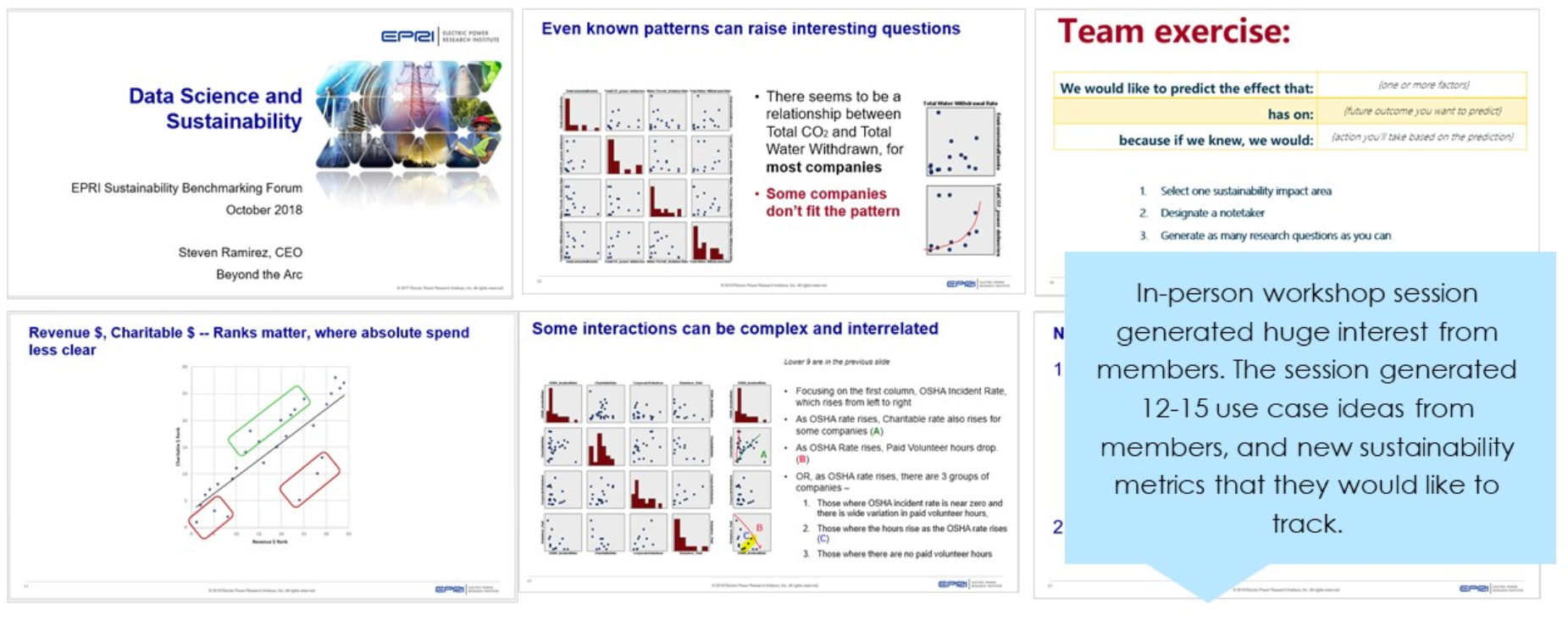
Member engagement: The TI project gave the Sustainability team an opportunity to start a dialogue with members about their hypothesis and the metrics that are of greatest importance to them. The workshop with members generated 12-15 hypothesis to explore.
Predictive variables: Through our analysis, we identified variables that might be better predictors of future performance and tagged them as valid and invalid variables.
SPSS Training: Provided Morgan Scott and a her analyst with training on using SPSS Modeler so that they can continue to explore her data without restrictions and pursue the issue of interests that the members identified during the workshop.
The Air Quality System (AQS) is EPA’s repository of ambient air quality data. AQS stores data from over 10,000 monitors, 5000 of which are currently active.
National Atmospheric Deposition Program
EPA’s Critical Loads Mapper Tool enables access to information on atmospheric deposition, critical loads, and their exceedances to better understand vulnerability to atmospheric pollution.
National Atmospheric Deposition Program
Detailed estimate of air emissions of both criteria and hazardous air pollutants from all air emissions sources.
The Toxics Release Inventory tracks the management of certain toxic chemicals that may pose a threat to human health and the environment.
https://earthdata.nasa.gov/earth-observation-data/near-real-time/hazards-and-disasters/air-quality
https://www.usgs.gov/centers/eros/science/national-land-cover-database
https://www.nodc.noaa.gov/ocads/oceans/
https://www.ncdc.noaa.gov/cdo-web/datatools/lcd
https://www.nrel.gov/analysis/jedi/index.html
Using JEDI, you can analyze the energy impacts of wind, biofuels, concentrating solar power, geothermal, marine and hydrokinetic power, coal, and natural gas power plants.
https://openei.org/wiki/Utility_Rate_Database
Rate structure information from utilities in the U.S. maintained by the U.S. Department of Energy
R Functions for Regression Analytics