


This the multi-page printable view of this section. Click here to print.

Resources for getting started and learning about AI.

Explore various data science EPRI use cases to further here.
Additional data science resources.
Predictive Analytics World The “premier machine learning conference.” Tracks in industry, deep learning, business, and more. Includes speakers, workshops, and networking opportunities.
Machine Learning and Data Mining (MLDM) Brings together researchers on machine learning and data mining. Conference includes talks, workshops, tutorials and exhibition.
AI & Big Data Expo Expo showcases next gen technologies and strategies from AI and big data. Tracks include Enterprise AI & Digital Transformation, Data Analytics for AI & IoT, Big Data Strategies and more.
Learn Data Science from the comfort of your browser, at your own pace with DataCamp’s video tutorials & coding challenges on R, Python, Statistics & more.
Get the latest tech skills to advance your career. Browse Nanodegree programs in AI, automated systems & robotics, data science, programming and business.

AI, Analytics, Data Science, and Machine Learning Courses, online and on-site.
Self-paced learning is the new trend and we must say, it’s really effective. With the evolution of technology, one of the benefits that have reached the common man is the exposure to educational content and information that will help him or her evolve as a person. With YouTube, this has gone to the …

Get a quick introduction to data science from Data Science for Beginners in five short videos. This video series is helpful if you’re interested in doing data science - or work with people who do data
( TensorFlow Training - https://www.edureka.co/ai-deep-learning-with-tensorflow )This video on Artificial Intelligence gives you a brief introduction to AI a….
Learn about evaluating your data to make sure it meets some basic criteria so that it’s ready for data science. This second video in the Data Science for Beginners series h…
This Data Science Tutorial will help you understand what is Data Science, who is a Data Scientist, what does a Data Scientist do and also how Python is used …
Metadata schema examples that help others at EPRI know what kind of data is available for them to use in research and how to search for this data.
This is a high level overview of the journey that PDU and its members are likely to follow for Data Analytics.
Data visualizations that highlight new insights. This use case took dat from a predictor tool in Generation to discover new insights with visualizations.
This use case shared preliminary data science findings with members to demonstrate a different view of their metrics.
Find more information on how to Leverage Data Science Smartly here.


Find more information here.
Visualizations help to identify patterns in data to discover and understand stories.
Target = FeS in Ash (% weight)

These charts show a mixed relationship with FeS in Ash (% weight). There may be two (or more) patterns.

Box plots show the median surrounded by the interquartile range (25th percentile to 75th percentile. The 2 clusters are well-separated.)


Learn more here.
Opportunity to use data science share with members a different point of view of their data.
Multivariate analysis: Provide members with more sophisticated understanding of the benchmark data by applying multivariate analysis. Discover the interrelationships between multiple variables in the study.
Predictive analysis: Members are interested in the interrelationship of the sustainability efforts. There is an opportunity to understand the causation that may be correlated to sustainability variables in the study.
External data: Provide members with greater context for the metrics by incorporating external data to understand climate, demographics, GIS/mapping and plant operations data may affect sustainability results. For example, the EPA has emissions and water flow data at a high level of detail that can inform the member’s sustainability strategy.
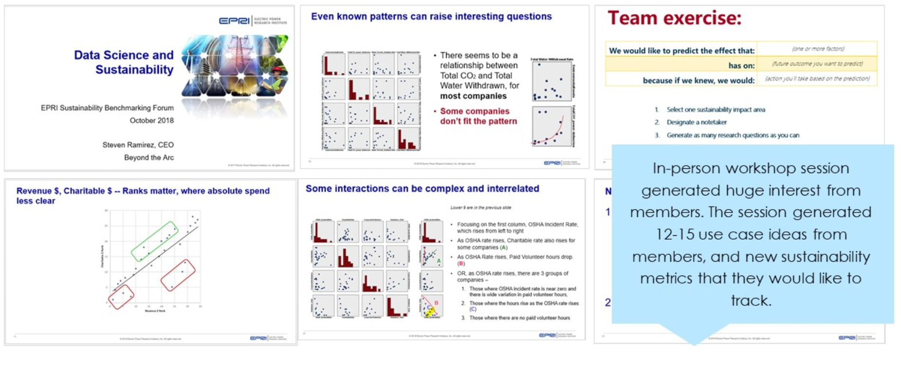
Member engagement: The TI project gave the Sustainability team an opportunity to start a dialogue with members about their hypothesis and the metrics that are of greatest importance to them. The workshop with members generated 12-15 hypothesis to explore.
Predictive variables: Through our analysis, we identified variables that might be better predictors of future performance and tagged them as valid and invalid variables.
SPSS Training: Provided Morgan Scott and a her analyst with training on using SPSS Modeler so that they can continue to explore her data without restrictions and pursue the issue of interests that the members identified during the workshop.
The Air Quality System (AQS) is EPA’s repository of ambient air quality data. AQS stores data from over 10,000 monitors, 5000 of which are currently active.
National Atmospheric Deposition Program
EPA’s Critical Loads Mapper Tool enables access to information on atmospheric deposition, critical loads, and their exceedances to better understand vulnerability to atmospheric pollution.
National Atmospheric Deposition Program
Detailed estimate of air emissions of both criteria and hazardous air pollutants from all air emissions sources.
The Toxics Release Inventory tracks the management of certain toxic chemicals that may pose a threat to human health and the environment.
https://earthdata.nasa.gov/earth-observation-data/near-real-time/hazards-and-disasters/air-quality
https://www.usgs.gov/centers/eros/science/national-land-cover-database
https://www.nodc.noaa.gov/ocads/oceans/
https://www.ncdc.noaa.gov/cdo-web/datatools/lcd
https://www.nrel.gov/analysis/jedi/index.html
Using JEDI, you can analyze the energy impacts of wind, biofuels, concentrating solar power, geothermal, marine and hydrokinetic power, coal, and natural gas power plants.
https://openei.org/wiki/Utility_Rate_Database
Rate structure information from utilities in the U.S. maintained by the U.S. Department of Energy
A. 3 Major Steps to Data Science Project
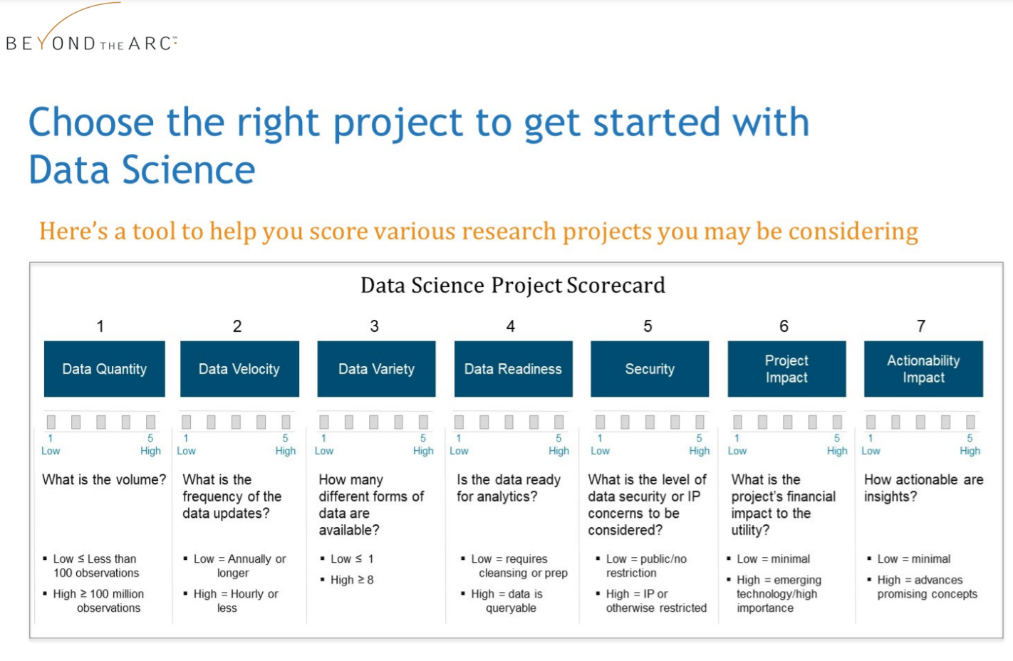
C. Data Science Project Scorecard
D. 10 Questions to Understand Your Data
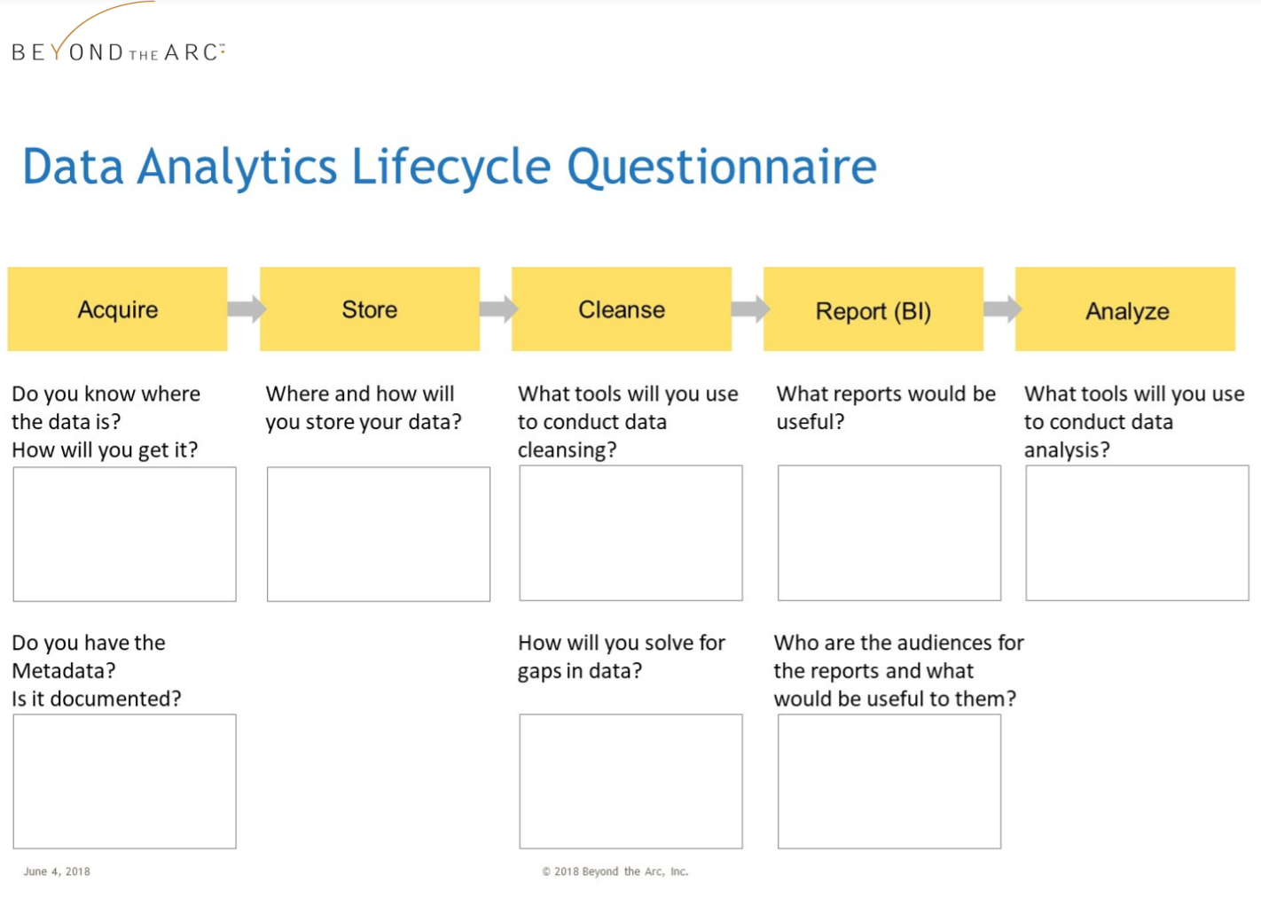
E. Data Analytics Lifecycle with Questionnaire
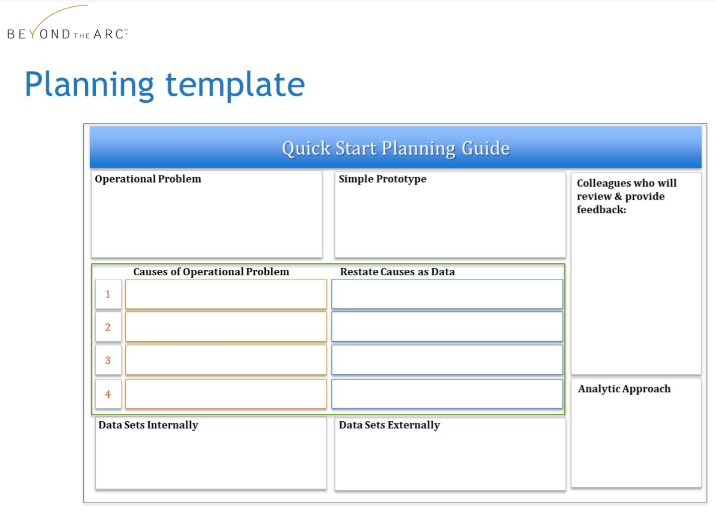
F. Data Analytics Planning Template

The electric power industry is experiencing a data-driven transformation. Rapid growth in the deployment of sensors, distributed assets, and “intelligent systems” means data is easier to access than ever before. To reap the benefits, utilities will need to master new analytics competencies — including managing and combining multiple sources and types of data, building analytic models, and interpreting findings to make better decisions.
To make it easier for you to start developing new capabilities, EPRI has developed 10 briefs on the theme Leveraging Data Science for Electric Power Industry Transformation. Each paper offers tips and tactical advice to accelerate your progress in data science and machine learning.
The briefs are organized into two series. Series 1 (4 briefs) describes major milestones in the journey toward data science mastery. Series 2 (6 briefs) addresses the Data Science Lifecycle.
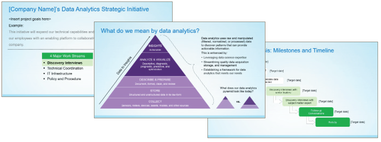
Learn how to successfully engage stakeholders to guide your data science strategy. Brief includes key steps in the process, a sample interview guide, and a presentation template you can customize and share internally.
Drive your data science journey with practical use case scenarios based on your company’s real challenges. The right use cases help test the applicability of concepts and how to tackle them.
Leaders in data science have learned that internal knowledge sharing is critical to success. Learn tips on how to implement a digital hub for collaboration to build your capabilities and increase adoption of data science best practices.
Improve your progress in machine learning and AI by understanding the technology, tools, and business processes you need to succeed. This Blueprint illustrates functional requirements and how to address them.
Series 2 includes six briefs that highlight real business challenges and solutions at different stages in the Data Science Lifecycle. These insights are designed to provide inspiration and ideas for solving similar challenges and address situations that are stage-specific.
In this brief, the challenge is transforming legacy data into useful assets. You’ll learn how to gain incremental value from legacy data by choosing a technology solution to extract, transform, and load data into a format that can be reused.
Collecting metadata is an important subprocess of the Acquire stage, and ideally should occur at the same time you acquire datasets. The challenge here is how to best document details about your data sources to enable sharing data and ensure proper interpretation of results.
The quantity of data, variety of sources and types of data, and ability to make data available to a wider group of users is a challenge to manage. In this brief, we explore how you may need to revise processes and tools.
In this brief, we cover the challenge of accelerating time-to-insight using visualization techniques. Data visualization can be applied to every stage of the Data Science Lifecycle to accomplish tasks more quickly and easily.
Most companies build systems to understand “what happened?” and “why did it happen?” This brief explores the challenge in machine learning and AI to answer a new set of questions like “what will happen next?” and “what actions should I take when it does happen?”
This brief is a case study about the practical reality when an analytics issue doesn’t fit into a single lifecycle stage. The challenge is to create a repeatable process for cleansing data that can be applied to multiple datasets, use data visualization to rapidly identify insights, and create preliminary advanced analytic models.
To start a data science project, the first step is to identify and assess the available sources of data. We define this as the Acquire stage of the Data Science Lifecycle. Once you identify the data sources, you can use data science tools to efficiently extract, transform, and load (ETL) historical data into a usable format to be used in new ways.
Here’s an example of how it can work… You start the project by selecting a use case (scenario addressing a real business challenge). Suppose your scenario involved a research program with 10+ years of historical data stored in multiple formats (e.g., disks, emails, photos, shared network drives, thumb drives). These materials were generated to address a specific question or research purpose, and had limited value once that question was resolved. However, your use case showed you could gain incremental value from these legacy materials by using new tools to transform and prepare data for analysis and insights.
Begin with a discovery process to understand what exists, and create an inventory of potential datasets. Note that some data may be stored on external drives or in remote locations.
Create an inventory template to help guide the teams in cataloging data more uniformly.
Select a use case to test and validate technical solutions for integrating the data and using it.
* Select tools and technologies to perform processes for data extraction,transformation, and loading (ETL). * Identify gaps, such as exception processes, necessary for sensitive information or unusual file formats. * Share access to the newly aggregated data with team members.
With data science tools, importing spreadsheets into a query-able database is effortless. Transformed data changes into a new structure from horizontal rows of data – to vertical columns of data grouped by common variables. You can then use the new structure for data visualization and advanced analytics.
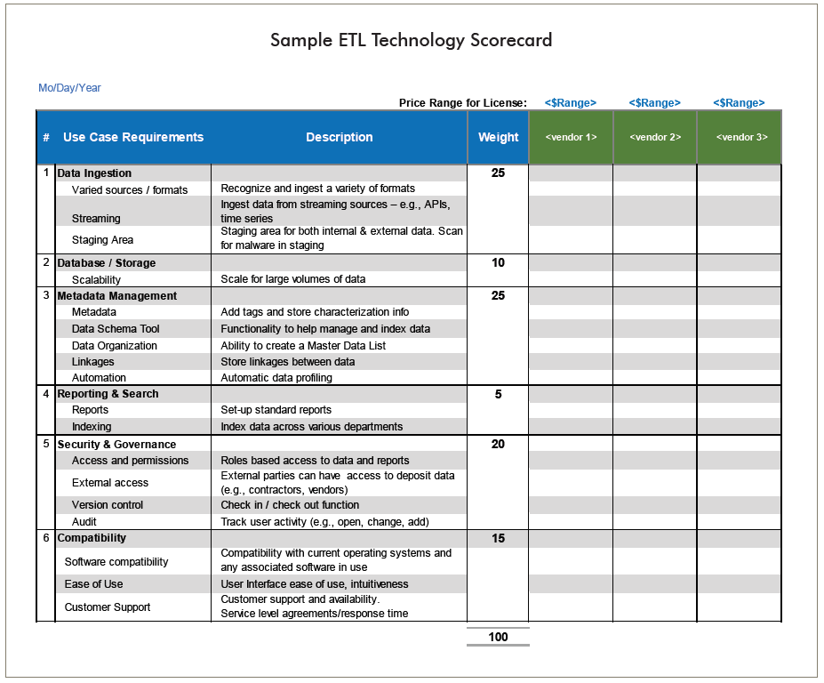
To help you evaluate ETL technology solutions, you can leverage our recommended list of business and technical requirements, and modify it for your organization. You can also use this sample scorecard to facilitate your efforts as your evaluate various ETL solutions.
By selecting a technology solution to extract, transform, and load data, you can develop a process to convert older, unused or forgotten data into assets that have ongoing value. When you implement a small proof of principle project, you help create a repeatable process that can be applied to other datasets. Over time, you can convert a substantial volume of legacy data to help address current and future business challenges.
How can advanced analytics help you extract new insights from you data?
Most companies have built programs and systems to understand “what happened?” and “why did it happen?” Machine learning and AI leads to new questions like “what will happen next?” and “what actions should I take when this happens?” This brief focuses on the key business challenge for the Analyze stage in the Data Science Lifecycle. Analyze is when you will apply data science tools and techniques to gain deeper insights from your data, and drive further inquiries to help solve business or operational problems.
Your objective is to explore new data science tools that can be integrated into your company’s toolset to enable advanced analytic modeling. With data science you can use data that may have been underutilized, or perhaps not used at all. You can also generate insights from data that was collected or used for a different purpose For example, many utilities participate in industry benchmarking, and find that reporting on metrics is valuable. With predictive analytics, you might capture even more value by asking a slightly different set of questions.
| Reporting on metrics might start with... | While data science methods might add... |
|---|---|
| How many poles did each company replace? | Why did companies on th east coast replace poles at a rate 25% higher than the west coast? |
| Tallying responses received to a set of survey questions | Using survey responses as a dataset, merging it with external data (e.g., weather data, household demographics) and finding significant correlations beyond the responses. |
| Historical information | Predictive or Prescription modeling that helps to make future decisions |
| Reactive | Proactive |
| Tracks company performance | Shapes company performance |
The Analyze stage involves using techniques such as multivariate analysis and predictive analysis, both of which are enhanced with the use of multiple data sources including external data.
Get a more sophisticated understanding of the metrics data by applying multivariate analysis.
These Statistical techniques help you discover the interrelationships between variables.
Get a more sophisticated understanding of the metrics data by applying multivariate analysis.
These Statistical techniques help you discover the interrelationships between variables.
Get a more sophisticated understanding of the metrics data by applying multivariate analysis.
These Statistical techniques help you discover the interrelationships between variables.
Precision is important because your question has to be supported by the available data. If you were to ask: What is the likelihood that this piece of equipment will fail within the next 7 days? In order to analyze it, you would need a historical record of equipment failures with at least daily frequency. If you’ve only collected that data on a monthly basis, or the asset has never had a failure, the proposed question may not be a good starting point.
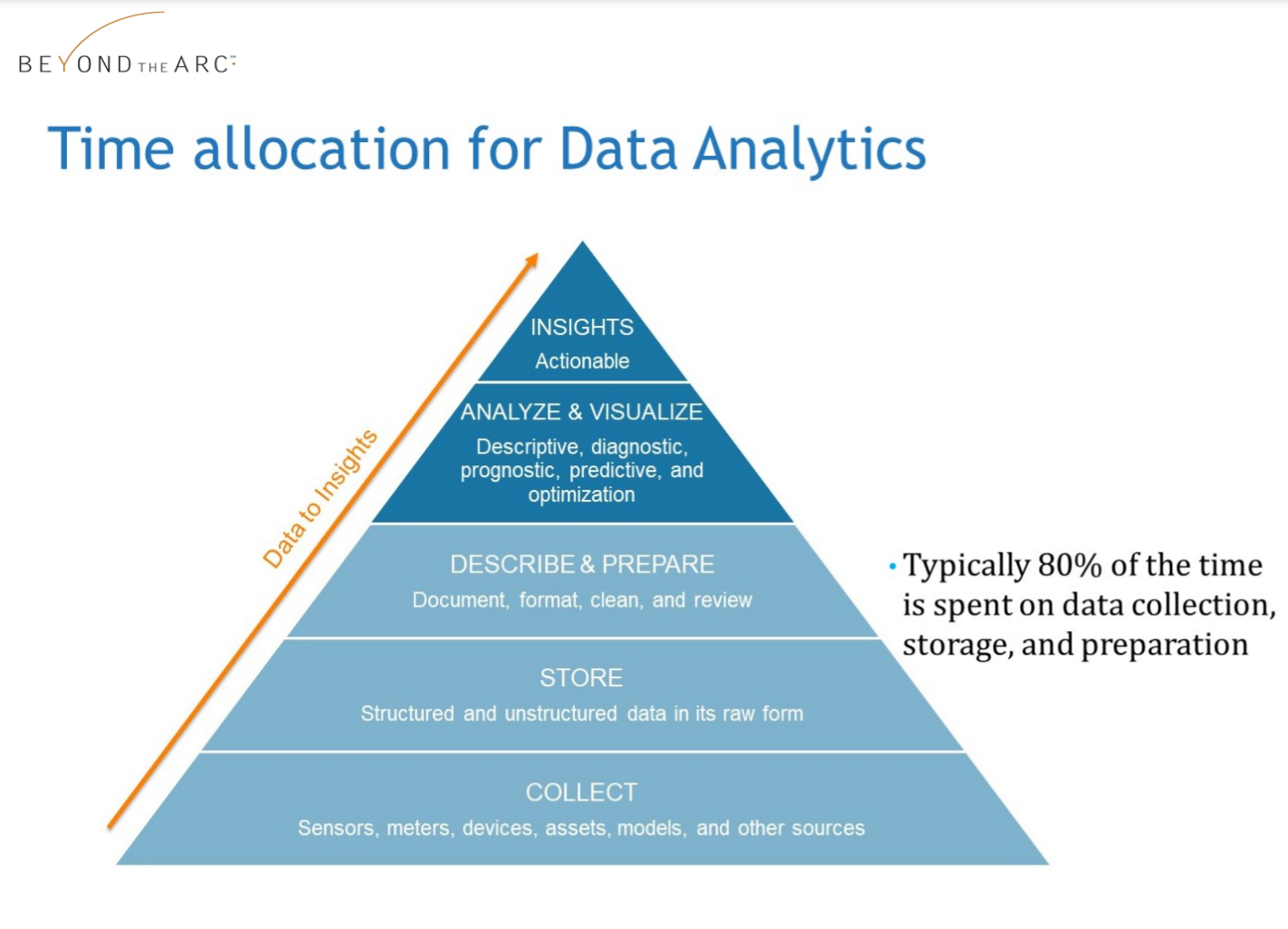
Once you refine your business or operational question, and matched it with relevant datasets, your focus turns to data preparation. In predictive analytics, it’s common to spend up to 80% of your project time on data preparation. Raw data may have issues with missing values, duplicate records, or inconsistencies. Data from multiple sources may need to be joined to create newly combined records. From these diverse inputs, you may need to derive new variables.
For example, a single parameter may not be predictive, but a calculated ratio using that parameter is. All of this work must take place before your analysis can truly begin. And often, preparing the data is iterative, so you may return to deriving new variables and merging additional data sources as your understanding of the problem evolves.
Suppose your utility has a class of aging assets, and you want to extend the life of those assets, identify critical equipment to replace, and improve your use of limited resources. To help you refine precise data science questions, it helps to map the operational problems to causes (in data terms), and available datasets that could be used for analysis.
With data science, you can pose different questions about your operations. In this example, we conduct a simple exploration of the relationship between weather and electric power pole replacement.
| We would like to predict the effect that: | Extreme Weather |
| has on: | the frequency of electric pole replacement |
| because if we knew, we would: | Focus on pole inspections and proactive replacements in service territories that have consistently bad weather |
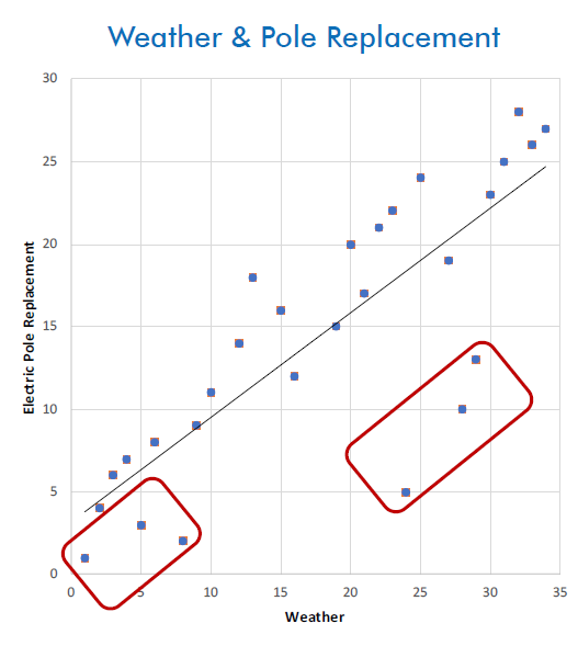
In this scenario, we needed a way to compare companies. Instead of using raw data, like inches of snowfall or number of poles replaced, we calculated rankings for the companies. We identified which companies replaced the most poles, and which had the highest number of extreme weather events.
In visualizing performance from this ranked perspective, Company A and Company B looked more similar, even though Company A replaced many more poles. This ranking method also helped to identify groups of companies that did not fit the generalized patterns.
Data visualization like this can help point you toward datasets that might be valuable in a predictive model. You might want to acquire data on pole materials, construction, soil conditions, prolonged vs. acute weather events, and much more. With data science, you can evaluate potentially thousands of inputs, and assess the degree to which each one contributes to an accurate prediction.
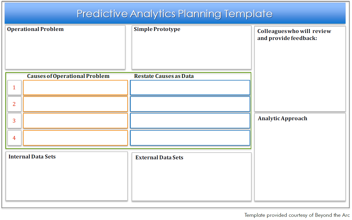
This planning template is a handy “quick start” tool to help you identify the key elements you will need for an analytics project. If you’re still exploring which data science solutions to use, take advantage of the Analytics Technology Evaluation Scorecard.
To encourage and accelerate data science capabilities, companies need an integrated system and supporting processes that support this goal. It starts with creating a framework for building and evolving your data science, machine learning and AI initiatives. To help you get started, EPRI designed a System Blueprint for Data Science (system architecture diagram). The Blueprint defines the essential elements and illustrates requirements of an integrated system. You can use it as a template, and modify and enhance elements to meet your specific needs and reflect your company’s practices and corporate policies.
This Blueprint is also a valuable tool to help stakeholders and decision-makers understand, validate, and communicate data science needs that enable predictive analytics and machine learning. For companies with more mature capabilities, the diagram can help them identify potential gaps in existing processes, procedures, technologies, or skills.
Here’s a snapshot of the Blueprint, which identifies the main components involved in the stages of the Data Science Lifecycle — Acquire, Store, Cleanse, Visualize, and Analyze.
Your objective is to design an approach that will help your company speed the adoption of data science best practices, processes, tools, and technology. To guide your planning, this Blueprint helps you understand the stages of the Data Science Lifecycle. The diagram shows the elements you’ll need to optimize that will lead to capturing more actionable insights from data and analytics.
Not only do you want to access all the data your teams may have already individually collected, but new data sources are becoming available daily from public sources such as government agencies, device manufacturers, and internet users through crowd sourcing. This Blueprint lists some examples of internal and external data sources, but the list is much longer and constantly changing.
This component involves tools to extract and consolidate data from primary databases in bulk or batch. The tools offer an efficient and systematic way to pull in volumes of data. Typically, the data travels to a staging environment for virus and malware screening, before moving into storage.
Cleansing is a critical first step before conducting any data mining or advanced analytics with datasets. Some of the activities include anonymizing data (e.g., removing confidential, identifiable customer information), normalizing data into the same unit of measure or same time of day, removing duplicates, and understanding the magnitude and significance of missing values.
Use the blueprint to understand how all the components fit into the Data Science Lifecycle.
Determine which of the nine blueprint components your company has in place now, and which ones you need to add or enhance in the future.
Assess the maturity of your company’s data science capabilities (usually obtained through Discovery Interviews) to ensure your implementation plan expands on the current skills.
Tip: See our brief on Optimizing Discover Interviews ▷
This Blueprint assumes all data owners and managers will store their data “in place” with no change to its current location. The virtual data lake indexes all datasets, making them searchable and available for use by others within the company. Permission for use is determined and granted by the data owner. Some organizations may opt to develop data lakes, data warehouses, data marts, or other architectures. Those strategies are compatible with the overall approach outlined in the Blueprint.
The tools include open source products like Python, R, as well as proprietary platforms that are available from a number of vendors. These tools help data scientists discover predictive information that will help them create analytic models and successfully get to insights.
The compute layer refers to the data processing power required to churn through volumes of data for visualization and advanced analytics. Processor-intensive work no longer requires physical machines or super computers. Today, companies can scale up with virtual machines (often cloud-based) to meet their changing needs for processing power.
This is a virtual sandbox for creating data visualizations and developing analytic models. For people working in data science, visualize and analyze are the most rewarding stages of the lifecycle because they lead to new insights.
Metadata refers to capturing descriptive information about datasets such as data source, data owner, and timeframe that data was collected. Metadata is critical to enable data sharing as it provides the information to create an index to make datasets searchable.
Data management is the organization of datasets and administration of permissions to review, edit, and use data in the virtual data lake.
Processes and rules for governance are needed to screen, evaluate, and index datasets before they are stored in the virtual data lake. Governance helps to ensure data lake contents remain relevant and useful. Security protocols are needed to design the user permissions for who can read, edit, and use the data.
To communicate with stakeholders, it’s helpful to use a system diagram like this Blueprint because it shows the key components and their relationships to one another.
For each major section of the Blueprint, consider developing proof of principle projects to demonstrate how technology can meet identified needs and solve real business challenges.
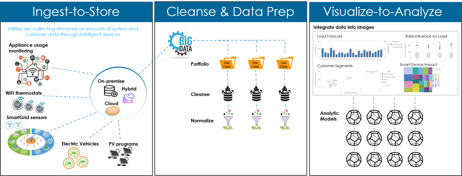
Smart sensors are transforming how we think about data – enabling utilities to gain insights about customer behavior such as energy use by appliance, lighting, heating unit, and air conditioning system. However, the ecosystem of intelligent devices is rapidly expanding, with differing protocols and proprietary data formats, where the same event can be measured in different ways. The sheer volume of data and lack of standards can create a roadblock for many energy companies seeking to make progress toward machine learning and AI.
This brief presents a repeatable process to cleanse, visualize, and analyze large volumes of customer data, which you can follow like a playbook. The exact data preparation and analysis steps may vary based on the dataset, but this approach will help you save time and avoid common pitfalls.
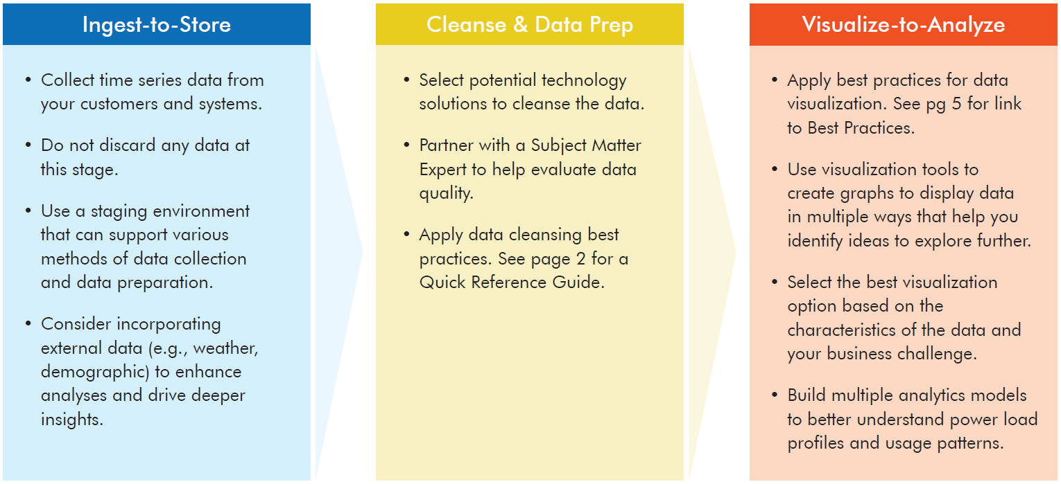
This infographic shows the data science workflows end-to-end. What becomes immediately clear is that analysis, and ultimately machine learning, is dependent on successful completion of many prerequisites.
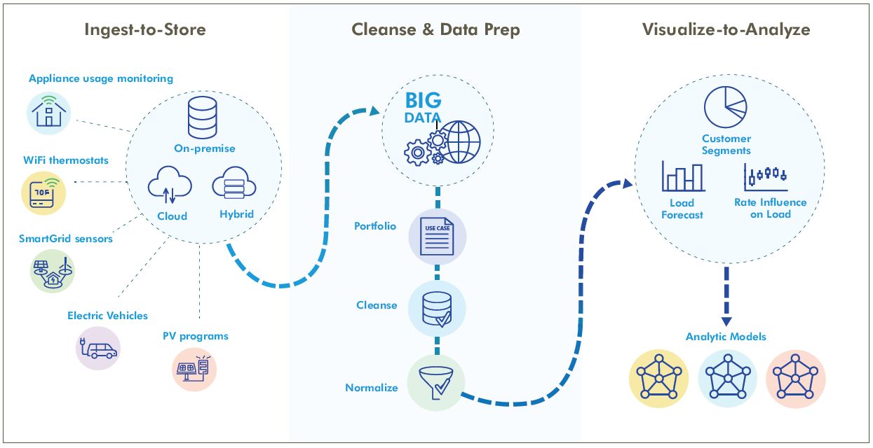
The infographic shows several types of smart devices that are collecting energy usage data (new devices enter the marketplace regularly), and how the data is moved into storage. The storage solution can be multifaceted with cloud, on-premise, and hybrid.
The data is pulled together and aggregated to become big data from thousands of households and individual devices, and potentially tens of millions of data points. Given the massive amounts of data collected, you may find it easier to get started with smaller datasets to focus on data understanding, cleansing, and normalizing.
Using visualization techniques can help you get to insights more rapidly (such as load forecasts and rate influence by customer segments). It can also inform you on how best to start building analytic models. Finally, once you understand what the data means, you can create advanced analytic models to help predict load changes and impacts to demand.
The proliferation of intelligent devices for consumers is enabling companies to collect customer-specific data at higher speeds and in larger amounts. That means repeatable processes for data cleansing are especially important. A key challenge is understanding how to cleanse and integrate that data efficiently. Integrating the data, often from multiple vendors, creates opportunities to understand end-use load profiles with much greater resolution, and apply new capabilities to assess load performance characteristics.
Here are some lessons learned to derive insights from large volumes of time series data. While sensors measure a multitude of specific conditions that would be helpful to energy companies, knowing how to get started can be a challenge.
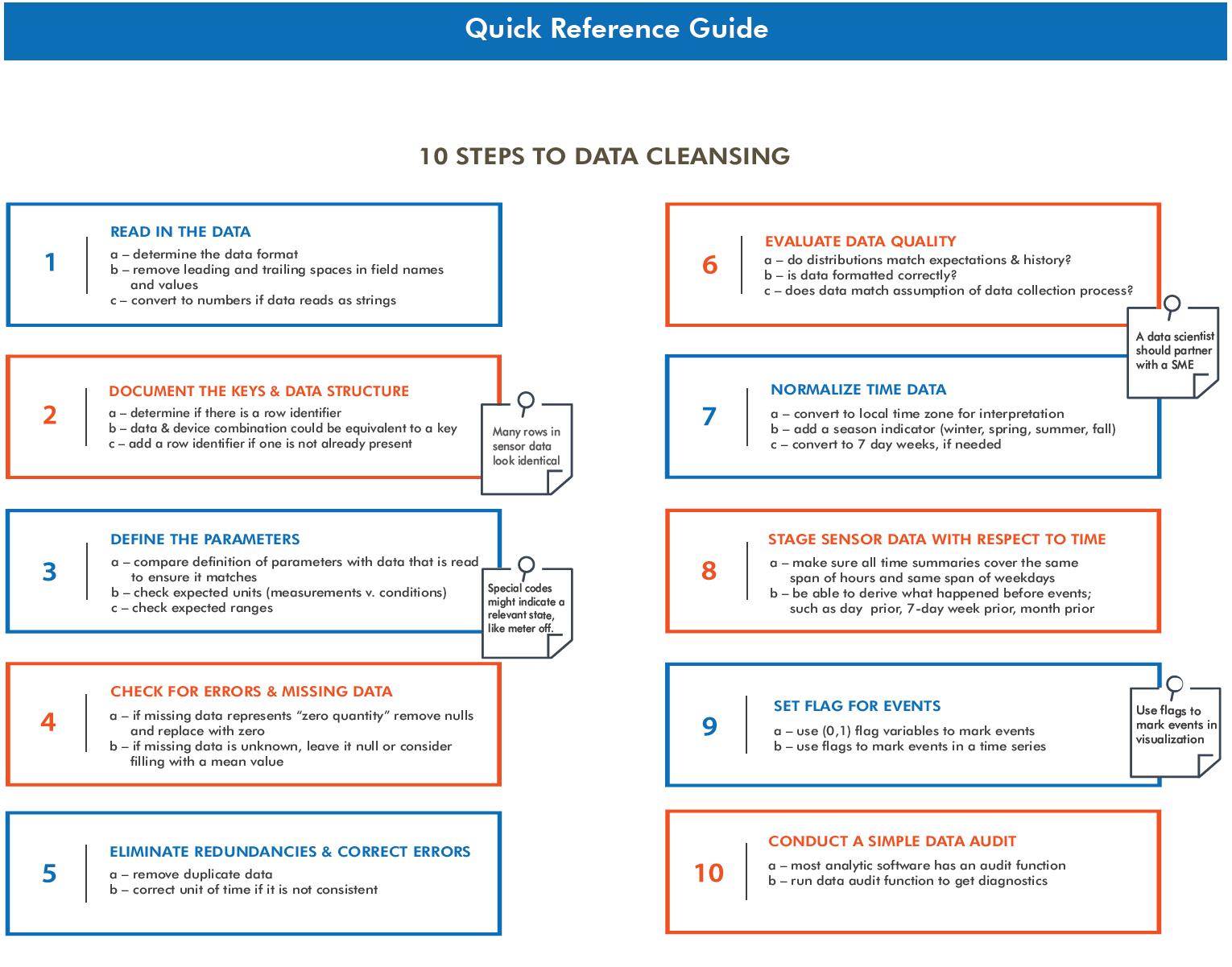
This brief provides standardized processes for you to follow when working with sensor data. Customers are continuing to adopt new smart devices to measure and control their homes and buildings, which means the volume of data will grow exponentially. Now is the time to begin to explore, understand and derive insights from this data and use it to transform customer relationship management, demand planning, and to build load profiles. Your work in these areas can lay the foundation for increasingly sophisticated analysis and breakthroughs.
To expedite the adoption of data science and promote the business value of analytics, it can be highly effective to develop a knowledge-sharing website. A Knowledge Resource Center website is often easy to build and scale, and serves as a “digital hub” for people across the organization to access data science best practices and expertise, spark collaboration, and explore tools and resources.
A Knowledge Resource Center site supports data science adoption by enabling rapid information sharing and connecting people with the resources and colleagues they need to be successful. As your company continues to aggregate valuable data, code and models, key learnings, and more, this digital hub increases in value. The site can also be helpful for staff development, supporting different levels of knowledge and skills.
Your objective is to create a knowledge sharing “digital hub” that can be implemented as a prototype within 4-6 months, and is scalable to an entire company. A core design requirement is that the solution will be easily accessible to everyone within the organization, and provide learning paths for users with varying levels of experience.
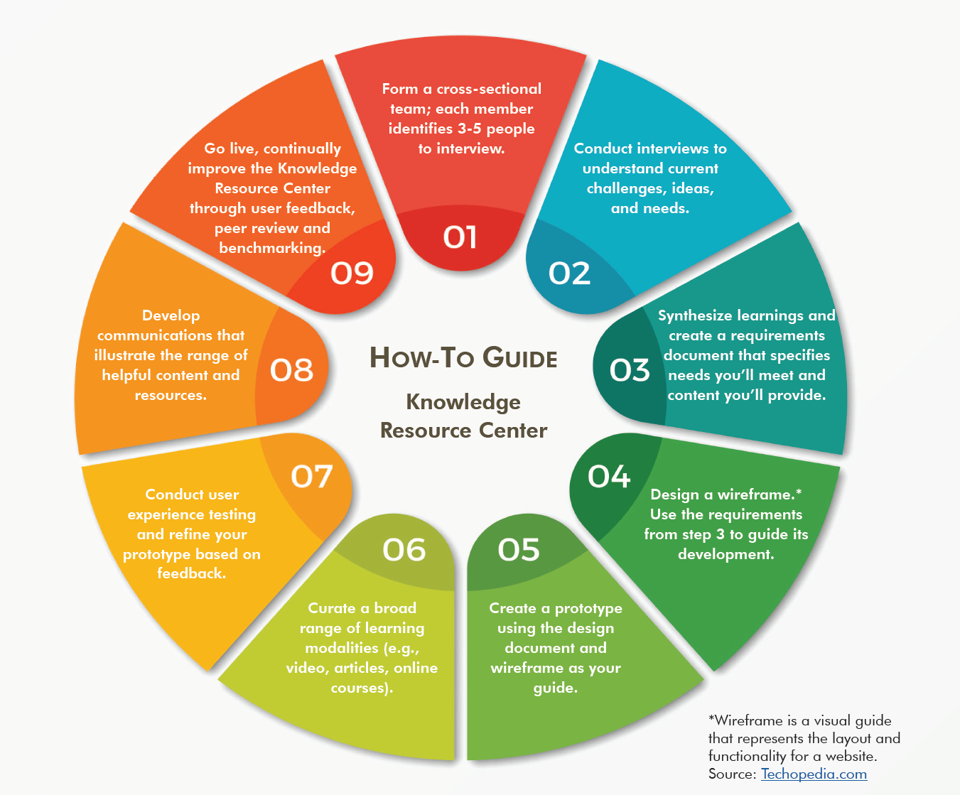
To help you get started building a Knowledge Resource Center:
A well-designed Knowledge Resource Center is an excellent way to expedite the adoption of data science. It’s important that the planning, building, and refining process is a collaborative effort across all departments and functional teams, and includes input from people with different levels of experience. Engaging the needs and interests of all stakeholders helps you gain a broad audience and maximize the benefit of this user community.
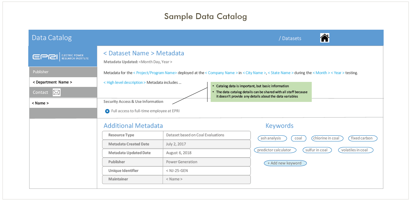
Metadata is descriptive information about data such as data source, location, owner, field names and so on. With advanced analytics, the definition of what constitutes data is greatly expanded. In addition to databases, your data includes archives of photos and video, diagnostic test results, sensor readings, log files, documents, spreadsheets, and more.
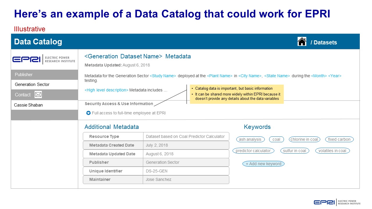
Given this expanded definition, data can be found almost anywhere and data owners distributed throughout your company. A metadata project will help you understand what data is available to be inventoried and shared with the rest of the organization. A logical first step is to take an inventory of datasets and collect standard information about them in an electronic catalog. In the example below, all of the fields are searchable and the record provides users with enough details to search, retrieve, and evaluate the dataset.
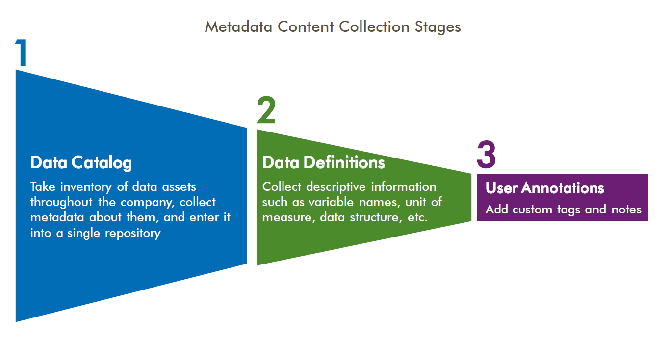
Your objective is to lead the development of a metadata management strategy to facilitate the sharing of datasets, create new opportunities for collaboration, and reduce redundancy in data collection. Typically, there are three stages in metadata content development: Data Catalog, Data Definitions, and User Annotations.
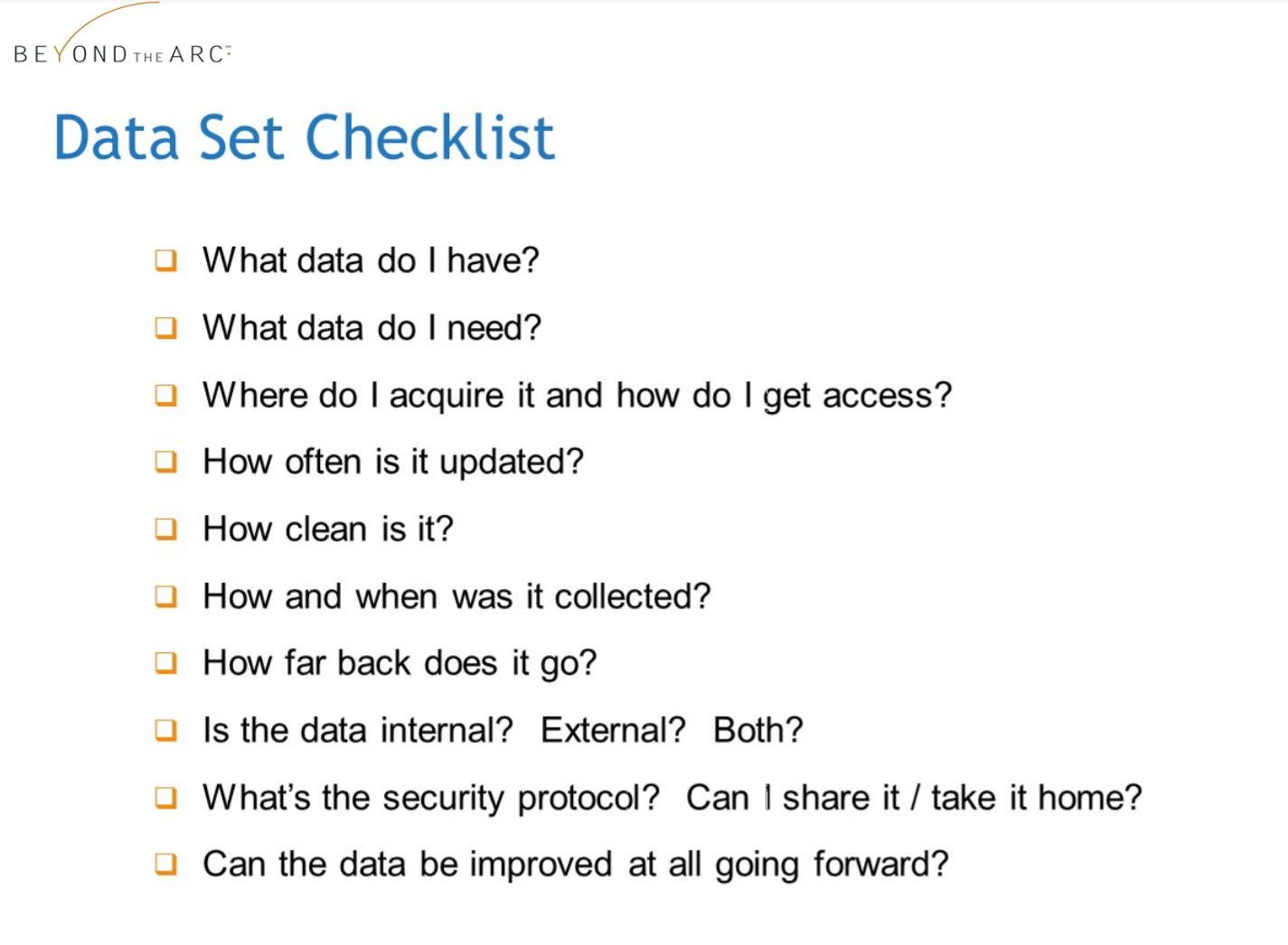
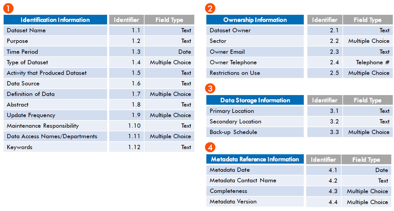
In your data catalog, the metadata (descriptive details) will enable others to discover and view the data. These six types of questions can guide you on what to include in the catalog design.
Who created the data?
Who owns the data?
Who will maintain it?
Who is using the data?
What is the purpose of the data?
What is the content of the data?
What is the security level?
When was the data created?
When was is last updated?
Is there a date when the data becomes invalid?
Where is the data stored?
Where did the data come from?
Why was the data created?
How is the data formatted?
How many databases store this data?
How can users gain access to the data?
Here is an example of a metadata schema for a data catalog, which shows how the descriptive information can be organized.
Metadata collection and management can give you significant insights into the variety and types of datasets available within your organization. You can also save time and resources in the long run. Your teams benefit by sharing reliable datasets and avoiding duplication.
When your solution is in place, you’ll make it easier for people to design and manage new analytic models that generate actionable insights to solve business challenges.
The first phase of a data science initiative is to gain understanding about issues your stakeholders are facing — and you do that through Discovery Interviews. These interviews lay the groundwork and provide direction for the strategies and tactics you’ll need to use data effectively. With Discovery Interviews, you’ll come to understand your organization’s current state, as well as gaps and needs related to data science and machine learning, such as maturity, readiness, and ways to address the path forward.
Discovery is a critical first step before you design a data science solution. It helps ensure your solution fits the needs of your organization, now and in the future.
Your objective is to understand and document your company’s unique needs and determine where your organization is on the data science maturity curve. Insights gained from Discovery Interviews will help you identify “use cases” (scenarios based on your organization’s real challenges), explore technology solutions that meet your company’s needs, and design a blueprint for moving forward with data science and machine learning.
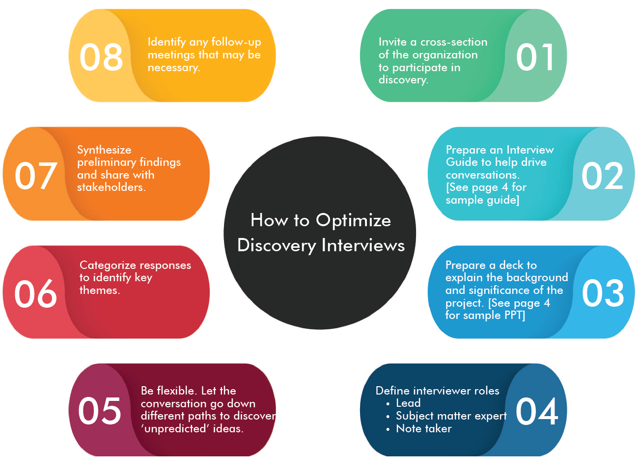
By sharing more information with your interviewees early in the process, you’ll get more out of the Discovery Interviews. For example, create a presentation about your data science initiative and the value that advanced analytics can bring to the organization.
By following the 8 steps for optimizing Discovery Interviews (page 2), you can uncover specific business questions from across your organization that can be addressed through data science. Creating a summary of all your interviews will help you to understand and document:
As your Discovery Interviews help you better understand the organizational challenges to be solved with data science, you build a foundation for the path forward. This process also enables you to increase engagement across the company, and motivate team members to enhance their data literacy and recognize the powerful business impact of data science, machine learning, and AI.
To get the most value from your data science and machine learning efforts and capture more actionable insights, you will need to identify scenarios based on your real business challenges. This approach will help you gain deep insights through analytics and help ensure they have a meaningful impact. We call these scenarios use cases, and they guide your team’s search for analytics solutions. Anchored by this real-world focus, you can uncover and validate business and technical requirements.
Use cases also help your organization understand the value of specific data science processes. As you explore approaches and experiment with tools and techniques, use case owners can play a key role in evaluating the shortlist of possible data science solutions.
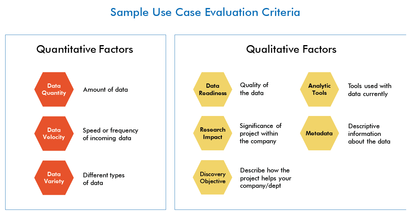
It’s important to create a consistent process to find and evaluate use cases, so you target what’s most helpful. A best practice process has three components: identifying scoring criteria, collecting and evaluating submitted ideas, and selecting the final use cases for execution.
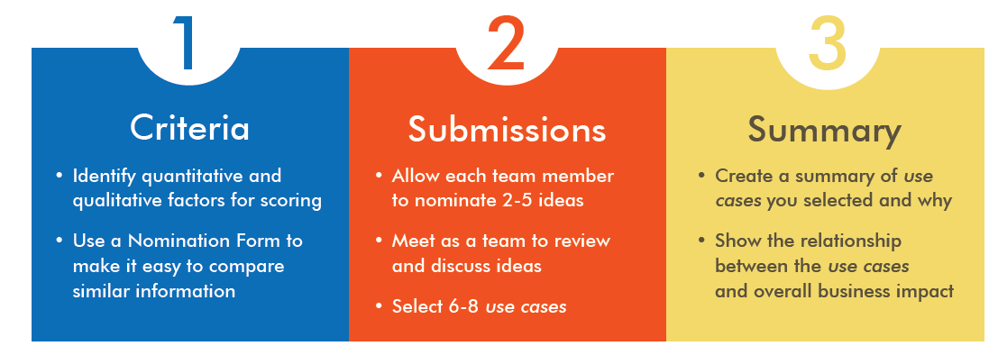
Use cases are an important part of a data science implementation because they help your organization understand the value of specific technical solutions and data science processes. By illustrating an array of real and current challenges, these scenarios help to engage stakeholders throughout the company, and build buy-in to support the overall analytics project and its outcomes.
Many power companies are deploying new technology and sensors to capture entirely new sets of data that can help improve operational efficiency, safety, and reliability. The real payoff is the ability to combine this new information with existing data found throughout your company – to discover new insights and anticipate future conditions. To ensure you can use this new data for advanced analytics such as predictive or prescriptive modeling, you may need to revisit your data storage strategy.
In this brief, we introduce you to ways to think about data collection to ensure you capture and store relevant data that can be used more effectively for advanced analytics.
As you work with new data sources from sensors, AMI, and smart systems it is important to check how data is being captured and stored early in the collection process. It helps you determine if you need to make adjustments to what data is being collected (types of data and various fields). You’ll want to identify early on if you need more or different information, and if you’re capturing the right data to support testing your hypotheses with analytics.
As an example, consider the preliminary data structure below, extracted from monitoring equipment. The Data IDs represent sensors at different locations throughout a plant, each of which typically collects different data. However, here we see two Data IDs capturing parameter A data, and two with parameter H data. This is unexpected. So you might question, is there more than one measurement location for each parameter? Or, is there an error in data collection and storage processes that records two readings?
To develop analyses using machine learning, you will likely be using data from operational systems that were originally collected for very different purposes. Your storage capacity needs may increase sharply to retain granular data that your systems currently either compress or discard. Not only will you save more data, but you will want to replicate data from operational systems so that it can be used in a separate analytics sandbox environment.
Start planning your data storage strategy based on what data structure you need to test your data science hypotheses. Your storage strategy needs to enable the creation of datasets to be used for advanced analytics.
Data analytics can be highly effective to help you make decisions and solve problems — but only if people can understand the results. Presenting data visually helps make your analysis more accessible and engaging. Consider all the possibilities of analysis if you could combine data from legacy sources (such as old databases, spreadsheets, and outdated proprietary systems) with current data, and use it in different ways. Applying data visualization techniques early in the process enables you to reveal new insights faster, so you can take action.
Graphical displays of data are an effective practice that should not just wait until your final presentation. It’s helpful to incorporate visualization techniques at every stage of the Data Science Lifecycle. As an example, the images below use the same data related to the Cleanse stage. In the “Before” view, you can see how a table with hundreds of rows can make it hard to find patterns. In the “After” view, in a quick glance at a scatterplot chart, you can easily identify patterns and detect outliers.
Your objective is to experiment with new ways to apply data visualization techniques to gain insights faster. When you can see patterns, you increase your understanding of the data. This may give you a headstart in planning how to improve the preparation and cleansing required to obtain meaningful results.
Below is an example of how data visualization is helpful in making it easier to understand and identify trends. This “After” view shows data for a solar corrosion analysis using box plots. Box plots provide a simple, intuitive way to show the overall range, median, and any outliers for each of the variables in the data.
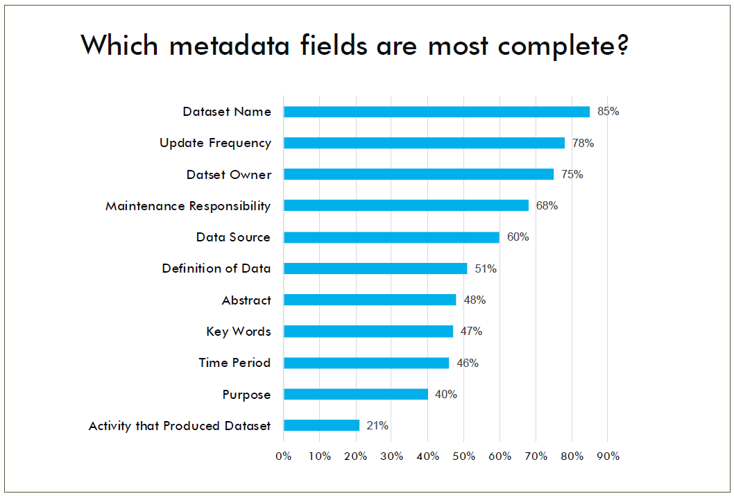
The graph below displays aggregated totals for metadata, which is part of the Acquire stage. It shows areas where metadata fields are mostly complete (e.g., Dataset Name, Update Frequency) and fields where information is missing (e.g., Abstract, Key Words, Time Period, Purpose).
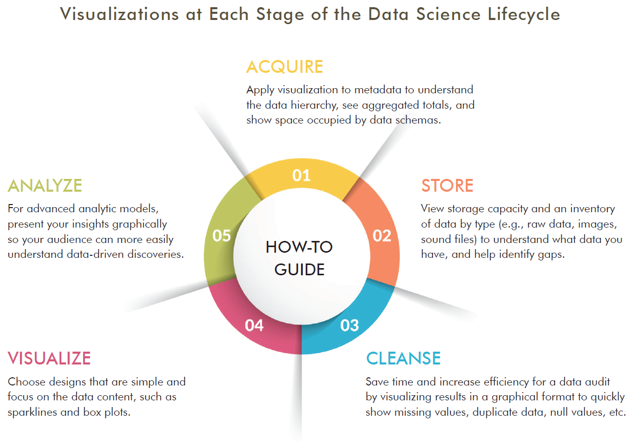
Data visualization can expedite processes in the Acquire, Store, and Cleanse stages of the Data Science Lifecycle by displaying insights that help advance your work to the next stage. Using these techniques is a more efficient way to understand insights faster for informed decision making.
To help you select the right visualization software tools, below you can download sample business and technical requirements, and use a sample scorecard for evaluating solutions to best meet your needs.
While there’s probably no single answer, if you have 10 min the resources below provide an excellent overview.

This is a do-it-yourself kit. It’s the easiest way to give AI a spin.

This is a do-it-yourself speaker kit.

Microsoft Azure shows how easy it is to get started and begin to experiment.
This Week in Machine Learning & AI The AI Podcast (by NVIDIA) Concering AI The Talking Machines Learning Machines 101
Artificial Intelligence Micromaster (Columbia University) - edX Machine Learning (Georgia Tech) - Udacity Oxford Deep NLP 2017 (Phil Blunsonm et al.) Machine Learning (mathematicalmunk) - Youtube Machine Learning (Andrew Ng) - Coursera Stanford CS224n - Natural Language Processing with Deep Learning
Resources for learning and getting started.
Explore various data science EPRI use cases to further here.
Additional data science resources.
Predictive Analytics World The “premier machine learning conference.” Tracks in industry, deep learning, business, and more. Includes speakers, workshops, and networking opportunities.
Machine Learning and Data Mining (MLDM) Brings together researchers on machine learning and data mining. Conference includes talks, workshops, tutorials and exhibition.
AI & Big Data Expo Expo showcases next gen technologies and strategies from AI and big data. Tracks include Enterprise AI & Digital Transformation, Data Analytics for AI & IoT, Big Data Strategies and more.
Learn Data Science from the comfort of your browser, at your own pace with DataCamp’s video tutorials & coding challenges on R, Python, Statistics & more.
Get the latest tech skills to advance your career. Browse Nanodegree programs in AI, automated systems & robotics, data science, programming and business.
AI, Analytics, Data Science, and Machine Learning Courses, online and on-site.
Metadata schema examples that help others at EPRI know what kind of data is available for them to use in research and how to search for this data.
This is a high level overview of the journey that PDU and its members are likely to follow for Data Analytics.
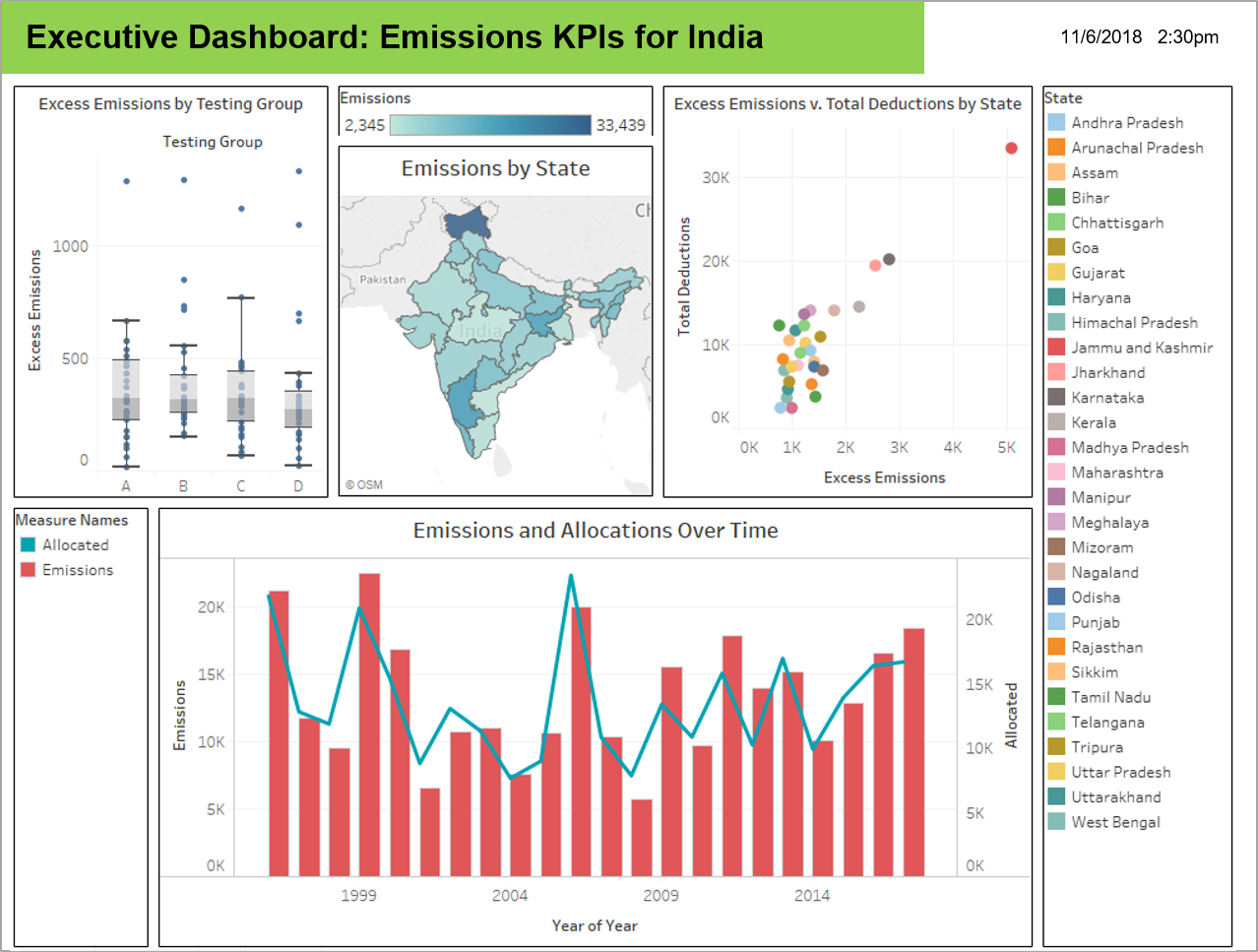
Data visualizations that highlight new insights. This use case took dat from a predictor tool in Generation to discover new insights with visualizations.
This use case shared preliminary data science findings with members to demonstrate a different view of their metrics.
Find more information on how to Leverage Data Science Smartly here.


Find more information here.
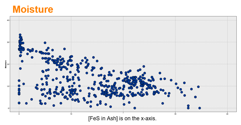
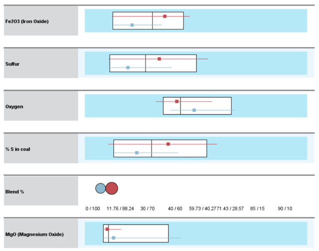
Visualizations help to identify patterns in data to discover and understand stories.

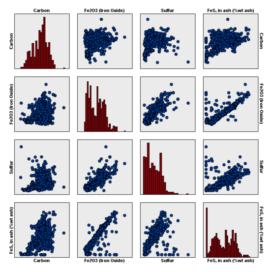
Target = FeS in Ash (% weight)

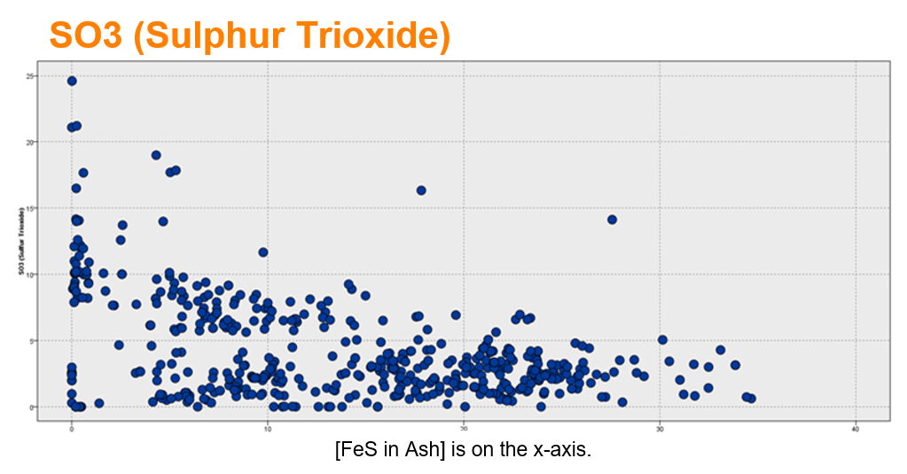
These charts show a mixed relationship with FeS in Ash (% weight). There may be two (or more) patterns.

Box plots show the median surrounded by the interquartile range (25th percentile to 75th percentile. The 2 clusters are well-separated.)


Learn more here.
Opportunity to use data science share with members a different point of view of their data.
Multivariate analysis: Provide members with more sophisticated understanding of the benchmark data by applying multivariate analysis. Discover the interrelationships between multiple variables in the study.
Predictive analysis: Members are interested in the interrelationship of the sustainability efforts. There is an opportunity to understand the causation that may be correlated to sustainability variables in the study.
External data: Provide members with greater context for the metrics by incorporating external data to understand climate, demographics, GIS/mapping and plant operations data may affect sustainability results. For example, the EPA has emissions and water flow data at a high level of detail that can inform the member’s sustainability strategy.

Member engagement: The TI project gave the Sustainability team an opportunity to start a dialogue with members about their hypothesis and the metrics that are of greatest importance to them. The workshop with members generated 12-15 hypothesis to explore.
Predictive variables: Through our analysis, we identified variables that might be better predictors of future performance and tagged them as valid and invalid variables.
SPSS Training: Provided Morgan Scott and a her analyst with training on using SPSS Modeler so that they can continue to explore her data without restrictions and pursue the issue of interests that the members identified during the workshop.
The Air Quality System (AQS) is EPA’s repository of ambient air quality data. AQS stores data from over 10,000 monitors, 5000 of which are currently active.
National Atmospheric Deposition Program
EPA’s Critical Loads Mapper Tool enables access to information on atmospheric deposition, critical loads, and their exceedances to better understand vulnerability to atmospheric pollution.
National Atmospheric Deposition Program
Detailed estimate of air emissions of both criteria and hazardous air pollutants from all air emissions sources.
The Toxics Release Inventory tracks the management of certain toxic chemicals that may pose a threat to human health and the environment.
https://earthdata.nasa.gov/earth-observation-data/near-real-time/hazards-and-disasters/air-quality
https://www.usgs.gov/centers/eros/science/national-land-cover-database
https://www.nodc.noaa.gov/ocads/oceans/
https://www.ncdc.noaa.gov/cdo-web/datatools/lcd
https://www.nrel.gov/analysis/jedi/index.html
Using JEDI, you can analyze the energy impacts of wind, biofuels, concentrating solar power, geothermal, marine and hydrokinetic power, coal, and natural gas power plants.
https://openei.org/wiki/Utility_Rate_Database
Rate structure information from utilities in the U.S. maintained by the U.S. Department of Energy
R Functions for Regression Analytics
While there’s probably no single answer, if you have 10 min the resources below provide an excellent overview.

Provides information about Machine Learning with specific examples, where it’s headed, and what to expect..

Video about the 7 steps to Machine Learning.

Check out these fun machine learning demos that you can do from your desk with your computer or smartphone.
Resources for getting started and learning about AI.
Explore various data science EPRI use cases to further here.
Additional data science resources.
Predictive Analytics World The “premier machine learning conference.” Tracks in industry, deep learning, business, and more. Includes speakers, workshops, and networking opportunities.
Machine Learning and Data Mining (MLDM) Brings together researchers on machine learning and data mining. Conference includes talks, workshops, tutorials and exhibition.
AI & Big Data Expo Expo showcases next gen technologies and strategies from AI and big data. Tracks include Enterprise AI & Digital Transformation, Data Analytics for AI & IoT, Big Data Strategies and more.
Michael O' Connor
Explorable Explanations project (Bret Victor’s brainchild) description. http://worrydream.com/ExplorableExplanations/.
There are several really good videos on YouTube and other media sites of Bret Victor giving presentations on this topic.
One of my favorites is his presentation on Media for Thinking the Unthinkable (https://vimeo.com/67076984).
Algorithms relating to sorting, sampling, and graphs (AMAZING)
Fully Interactive and Dynamic Linear Algebra textbook
Have you ever wanted to see an algorithm’s code run? It’s cooler than you would expect.
Added Bonus: Not only does it have an impressive collection of pre-built algorithms to choose from, but it also allows you to input your own code!
Nearly all of Digital Signal Processing using Fourier Transforms explained visually
Probability and Statistics (2017 Kantar Information is Beautiful Winner)
The full data science workflow that is embedded in StitchFix’s business process (really cool)
Coursera, Udacity, and codeacademy are good start points.
Datacamp is an example of an interactive web environment with lots of lessons for non-programmers to get started without ever speaking one of the languages.
Data Science Central is a good resource for staying at forefront of industry trends in data science.
Kaggle hosts data science competitions to practice, hone in skills with messy, real world data, and tackle actual business problems. Employers take Kaggle rankings seriously, participation is seen as relevant, hands-on project work.
KDnuggets has compiled an extensive list.
[http://www.kdnuggets.com/2015/07/good-data-science-machine-learning-cheat-sheets.html]
Data Science CheatSheets are there to help.
Metadata schema examples that help others at EPRI know what kind of data is available for them to use in research and how to search for this data.
This is a high level overview of the journey that PDU and its members are likely to follow for Data Analytics.
Data visualizations that highlight new insights. This use case took dat from a predictor tool in Generation to discover new insights with visualizations.
This use case shared preliminary data science findings with members to demonstrate a different view of their metrics.
Find more information on how to Leverage Data Science Smartly here.


Find more information here.
Visualizations help to identify patterns in data to discover and understand stories.

Target = FeS in Ash (% weight)


These charts show a mixed relationship with FeS in Ash (% weight). There may be two (or more) patterns.
Box plots show the median surrounded by the interquartile range (25th percentile to 75th percentile. The 2 clusters are well-separated.)


Learn more here.
Opportunity to use data science share with members a different point of view of their data.
Multivariate analysis: Provide members with more sophisticated understanding of the benchmark data by applying multivariate analysis. Discover the interrelationships between multiple variables in the study.
Predictive analysis: Members are interested in the interrelationship of the sustainability efforts. There is an opportunity to understand the causation that may be correlated to sustainability variables in the study.
External data: Provide members with greater context for the metrics by incorporating external data to understand climate, demographics, GIS/mapping and plant operations data may affect sustainability results. For example, the EPA has emissions and water flow data at a high level of detail that can inform the member’s sustainability strategy.

Member engagement: The TI project gave the Sustainability team an opportunity to start a dialogue with members about their hypothesis and the metrics that are of greatest importance to them. The workshop with members generated 12-15 hypothesis to explore.
Predictive variables: Through our analysis, we identified variables that might be better predictors of future performance and tagged them as valid and invalid variables.
SPSS Training: Provided Morgan Scott and a her analyst with training on using SPSS Modeler so that they can continue to explore her data without restrictions and pursue the issue of interests that the members identified during the workshop.
The Air Quality System (AQS) is EPA’s repository of ambient air quality data. AQS stores data from over 10,000 monitors, 5000 of which are currently active.
National Atmospheric Deposition Program
EPA’s Critical Loads Mapper Tool enables access to information on atmospheric deposition, critical loads, and their exceedances to better understand vulnerability to atmospheric pollution.
National Atmospheric Deposition Program
Detailed estimate of air emissions of both criteria and hazardous air pollutants from all air emissions sources.
The Toxics Release Inventory tracks the management of certain toxic chemicals that may pose a threat to human health and the environment.
https://earthdata.nasa.gov/earth-observation-data/near-real-time/hazards-and-disasters/air-quality
https://www.usgs.gov/centers/eros/science/national-land-cover-database
https://www.nodc.noaa.gov/ocads/oceans/
https://www.ncdc.noaa.gov/cdo-web/datatools/lcd
https://www.nrel.gov/analysis/jedi/index.html
Using JEDI, you can analyze the energy impacts of wind, biofuels, concentrating solar power, geothermal, marine and hydrokinetic power, coal, and natural gas power plants.
https://openei.org/wiki/Utility_Rate_Database
Rate structure information from utilities in the U.S. maintained by the U.S. Department of Energy
R Functions for Regression Analytics
Stay updated, stay connected.

Resources for HR, Legal & Supply Chain to learn about Data Science and AI
Predictive Analytics World The “premier machine learning conference.” Tracks in industry, deep learning, business, and more. Includes speakers, workshops, and networking opportunities.
Machine Learning and Data Mining (MLDM) Brings together researchers on machine learning and data mining. Conference includes talks, workshops, tutorials and exhibition.
AI & Big Data Expo Expo showcases next gen technologies and strategies from AI and big data. Tracks include Enterprise AI & Digital Transformation, Data Analytics for AI & IoT, Big Data Strategies and more.
Learn Data Science from the comfort of your browser, at your own pace with DataCamp’s video tutorials & coding challenges on R, Python, Statistics & more.
Get the latest tech skills to advance your career. Browse Nanodegree programs in AI, automated systems & robotics, data science, programming and business.
AI, Analytics, Data Science, and Machine Learning Courses, online and on-site.
Self-paced learning is the new trend and we must say, it’s really effective. With the evolution of technology, one of the benefits that have reached the common man is the exposure to educational content and information that will help him or her evolve as a person. With YouTube, this has gone to the …
Get a quick introduction to data science from Data Science for Beginners in five short videos. This video series is helpful if you’re interested in doing data science - or work with people who do data
( TensorFlow Training - https://www.edureka.co/ai-deep-learning-with-tensorflow )This video on Artificial Intelligence gives you a brief introduction to AI a….
Learn about evaluating your data to make sure it meets some basic criteria so that it’s ready for data science. This second video in the Data Science for Beginners series h…
This Data Science Tutorial will help you understand what is Data Science, who is a Data Scientist, what does a Data Scientist do and also how Python is used …
https://www.altexsoft.com/blog/datascience/how-to-structure-data-science-team-key-models-and-roles/
https://www.datasciencecentral.com/profiles/blogs/data-scientist-core-skills
https://www.kdnuggets.com/jobs/14/06-13-thomsonreuters-data-scientist-data-innovation-lab.html
http://www.abajournal.com/lawscribbler/article/what_i_write_about_when_i_write_about_ai
https://www.digitalauthority.me/insights/ai-supply-chain-strategy-24-04-2018
This resource has been designed as a way to support you in learning, sharing and infusing data science into your research projects. You’ll find best practices, articles, training resources, tools, community support and much more. Our goal with ACE is to help you apply advance analytic thinking and tools, no matter where you are in skills and knowledge, to achieve new discoveries in your field of expertise.
The Analytics Center of Excellence (ACE) is a website that provides users with tools, best practices, and a broad range of resources to help them understand data science and adopt advanced approaches. It is a hub of content that has been curated to make it easier to build new skills, spark collaboration and foster innovation.
Users will have a single location to help them with data science topics that have been curated specifically for EPRI. And, the ACE site will be continuously updated and refreshed to make sure it stays relevant.
ACE has been designed with four personas that might be using the site – Beginner, Intermediate, Advanced, or Functional Role. The site offers similar categories of content under each persona.
Training courses, conferences & more. Provides links to online training, popular conferences and cheat sheets and other ways to learn quickly.
EPRI Community Support. This will list people at EPRI who can provide support and assistance to colleagues internally. These are people available to help and provide ideas when a user is having issues or a user needs assistance brainstorming some ideas.
Uses Cases. Lists the use cases that were part of the Technology Innovation project. These use cases were foundational in the learning and development of the ACE site.
Tools & Resources. Links to explore internal EPRI resources and external tools, ideas and examples curated to help users.
Video Coming Soon…
ACE is currently in the beta stage. ACE is available to everyone.
